Typing questions into a chatbot is nice, but speaking often feels more natural. In fact, some experts encourage people to talk to generative AI instead of typing, in part to get out of the habit of using them as glorified search engines. “If you haven’t tried voice chatting with an AI model to see the appeal, you should,” advises University of Pennsylvania professor Ethan Mollick, who studies innovation and artificial intelligence. “Anthropomorphism is the future, in ways good and bad.”
Now, chatbots you can talk to—and that speak back—have come to R and the tidyverse.
One such bot surfaced at last month’s posit::conf(2025) data science conference: ggbot2, which you can talk to in order to create ggplot2 data visualizations.
Speech is a “very fast and fluid interaction,” Posit Chief Scientist Hadley Wickham said in his conference keynote, which included a brief ggbot2 demo. “My goal has always been for the code to get out of the way, and for you to express your ideas so you can interact with the data as quickly as possible.”
Tell ggbot2 what you want in a spoken conversation, and it will generate plots and ggplot2 R code from your data.
A week or so after the conference, Posit released the ggbot2 R package, which you can try on your own computer.
ggbot2 relies on the shinyrealtime package, which integrates OpenAI’s Realtime API with Shiny apps written in either R or Python. shinyrealtime apps can also generate data visualization code in either language.
All ggbot2 and shinyrealtime applications use OpenAI’s Realtime API for conversational voice chats, which Posit CTO Joe Cheng told me he found particularly well suited for this type of work. OpenAI says its Realtime API was designed for low latency, elegant handling of user interruptions, and tool calling. So, you will need an OpenAI API key to use either ggbot2 or shinyrealtime.
ggbot2 setup
You can install ggbot2 from GitHub (Posit recommends pak::pak("tidyverse/ggbot2") ) and load it with library(ggbot2). Then, you can launch the ggbot2 Shiny app to use with your own data frame with ggbot(my_dataframe).
Note that the app needs to be in a full browser like Chrome or Firefox and not your IDE’s viewer pane in order to access your computer’s microphone.
For a simple test, I downloaded one of my sample data sets, US state population changes grouped by Census Divisions in 2000, 2010, and 2020:
dist_pops It was pretty cool to simply speak a request like “I’d like to visualize population change by division between 2010 and 2020. Any ideas?” and see both generated code and a bar plot appear. Plus, I could then tell it changes such as “Sort the bars from largest to smallest” or “Make the X-axis text a little bigger.”
This was a pretty basic request. But for more complex work, you may need a little patience—and coding knowledge. For example, the first time I asked ggbot2 to make a map of all states data, the result was “Error: there is no package called ‘ggthemes’.” R users know that means the package needs to be loaded first (and installed if it’s not already on their system), but someone who doesn’t code might be stymied. Several other times, I got an “Error: could not find function ‘%>%’.”
“You couldn’t just give this to anyone,” Wickham said during his demo. “I’m using my knowledge of good visualization practices. I know what ggplot2 can do.” He said the tool would sometimes “kind of go off the deep end and start using weird ggplot2 features, and I would just tell it, ‘Hey, I want to use this geom.’ It absolutely benefits from my expertise as a data scientist and software engineer, but I’m no longer quite so limited by what my memory of ggplot2 code is.”
Wickham created ggplot2. If he needs help remembering all of the package’s functionality, it’s fair to say that most of the rest of us probably do, too.
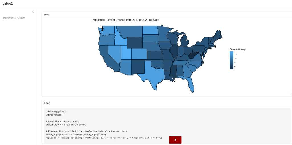
To make a map, I imported data with
state_pops Once the app loaded, I asked ggbot2 to “Make a map of the population percent change from 2010 to 2020” and then “Remove background grid and all axes.”
Foundry
ggbot2 chose to display only the 48 contiguous states, even though the data set includes Alaska, Hawaii, and Puerto Rico. I didn’t have great success getting it to include Alaska and Hawaii as insets, although to be fair this isn’t a mapping application.
The ggbot2 app includes estimated LLM costs per session—which is useful, since I could see myself running up a bill if I played around with it too long, especially since results are usually different each time you make the same request. OpenAI’s Realtime API currently costs $4 per million input tokens and $16 per million output, compared with $1.25 input and $10.00 output for GPT-5. OpenAI announced a GTP-40 mini Realtime model preview earlier this month that is less expensive, but I didn’t see a way to specify the new model when I tested ggbot2.
shinyrealtime setup
The shinyrealtime GitHub repository has both R and Python demo apps, although I’ve only tried the R version. One advantage of shinyrealtime is that the R app can also generate Python visualization code if asked.
To start, install the R package with remotes::install_github("posit-dev/shinyrealtime/pkg-r"). Note: I’ve seen instructions that say remotes::install_github("jcheng5/shinyrealtime/pkg-r"), but that doesn’t work.)
There’s a basic demo app in the repo for simple chatting at https://github.com/posit-dev/shinyrealtime/tree/main/pkg-r#readme and a dataviz-focused demo app at https://github.com/posit-dev/shinyrealtime/blob/main/app.R.
Unlike the stand-alone ggbot2 app, the dataviz demo app in the shinyrealtime repository needs a few extra files. I also had to download prompt-r.md and shutter.mp3. It might be easier to just git clone the whole repo from https://github.com/posit-dev/shinyrealtimefile.
If you want the R app to generate Python dataviz code locally, you’ll need to manually install the reticulate R package on your system. That should take care of installing all the other Python libraries you’ll need. Or, you could go through the app.R code and comment out all the Python-related code if you don’t want to install reticulate and you don’t need Python visualizations.
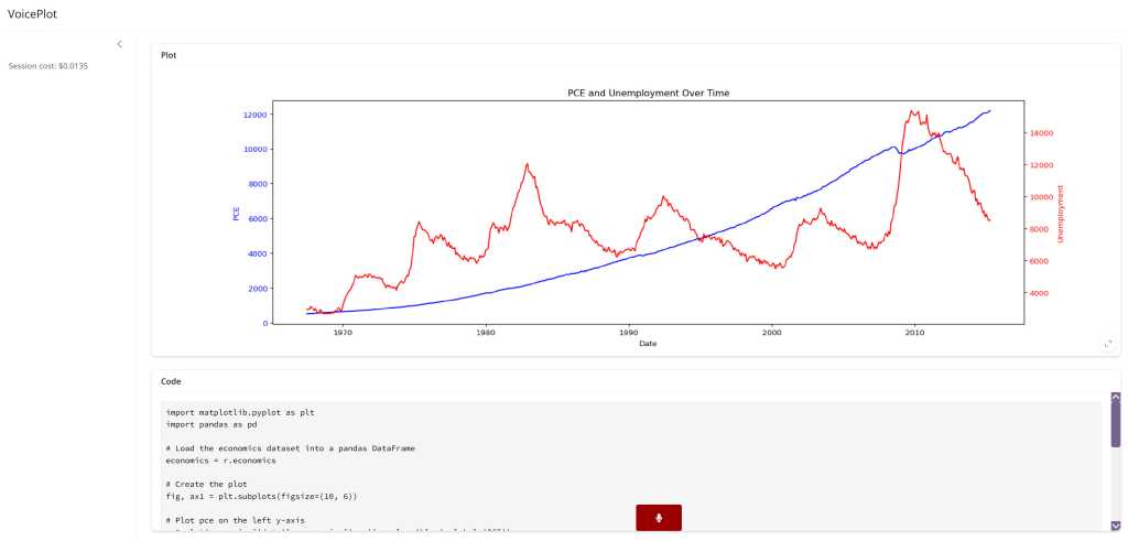
Asking ggbot2 to “Create an interesting data visualization of the economics data set in Python” returned this graph:
Foundry
and this Python code:
import matplotlib.pyplot as plt
import pandas as pd

# Load the economics dataset into a pandas DataFrame
economics = r.economics

# Create the plot
fig, ax1 = plt.subplots(figsize=(10, 6))

# Plot pce on the left y-axis
ax1.plot(economics['date'], economics['pce'], color='blue', label='PCE')
ax1.set_ylabel('PCE', color='blue')
ax1.tick_params(axis='y', labelcolor='blue')

# Create a second y-axis for unemployment
ax2 = ax1.twinx()
ax2.plot(economics['date'], economics['unemploy'], color='red', label='Unemployment')
ax2.set_ylabel('Unemployment', color='red')
ax2.tick_params(axis='y', labelcolor='red')

# Set the x-axis label
ax1.set_xlabel('Date')

# Set the title
plt.title('PCE and Unemployment Over Time')

# Show the plot
plt.show()
Note that the Python code won’t run outside the R app as is, because it expects an R data frame with the economics data. However, that’s easy to fix if the data is in a CSV file and you import it with economics = pd.read_csv("economics.csv") instead of economics = r.economics.
To use your own data instead of the hard-coded demo data frames, you’ll need to tweak the app.R code. I did it by loading my own data sets at the top of app.R and then changing the first line of code in this block to be my data sets instead of mpg, diamonds, economics, iris, and mtcars.
for (dataset in c("mpg", "diamonds", "economics", "iris", "mtcars")) {
  df
After those steps, your app should be ready to go. Click the Run button in the app.R file if you’re in RStudio or Positron, or run shiny::runApp("app.R") in an R console. Again you’ll need to make sure to open the app in a full-fledged browser instead of an IDE viewer pane.
As of last month’s positconf conference, shinyrealtime was “a tool that we’ve spent maybe six hours collectively on,” Wickham said. More time has been invested in it since, but it’s still in early stages for now. Nevertheless, these apps give R users a glimpse of what could be the next step in merging generative AI with Shiny: web apps that understand your spoken commands and speak back.